Made Patisserie
BrandingOctober 2014
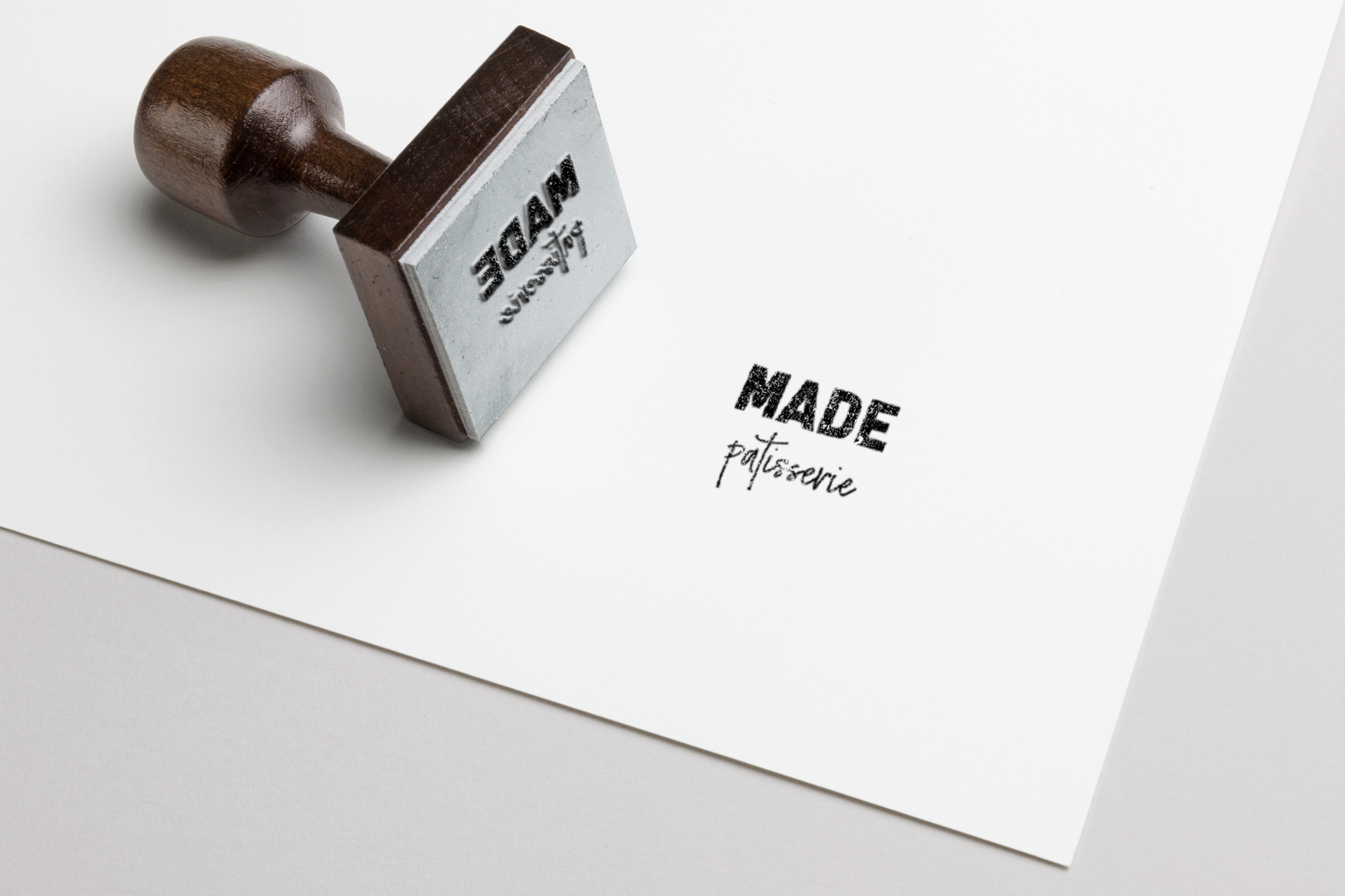
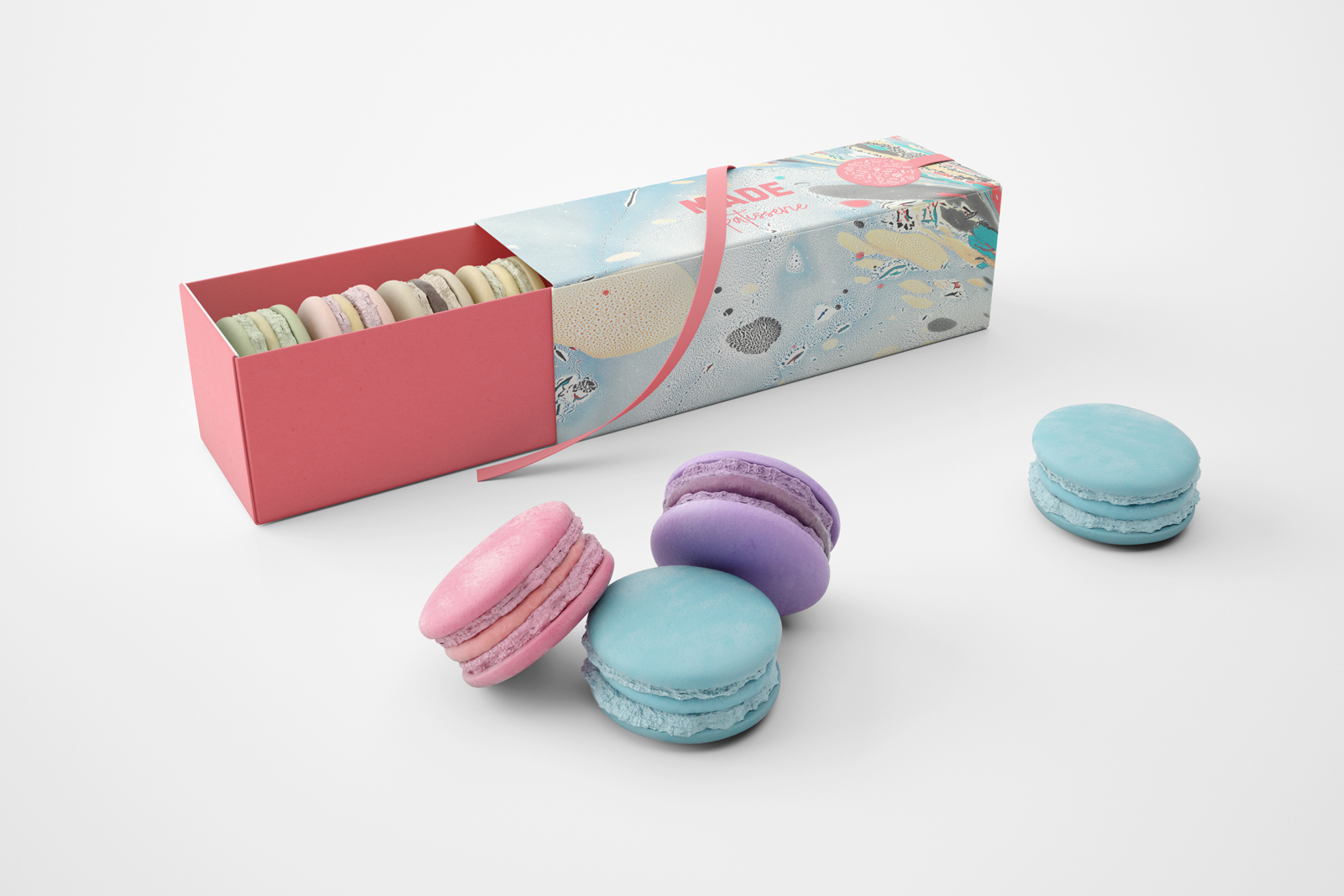
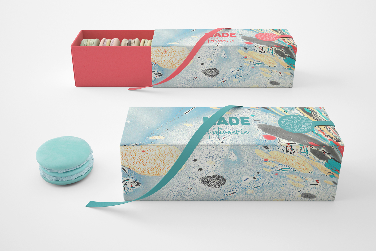
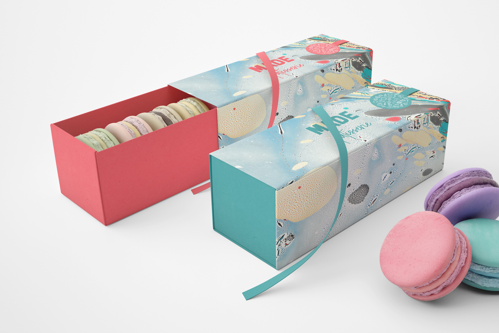
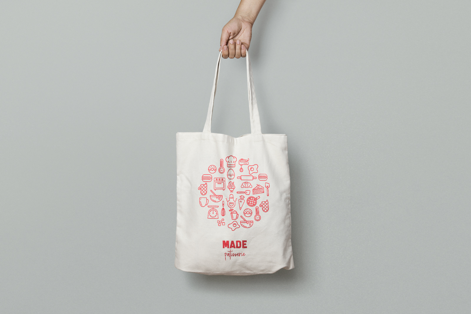
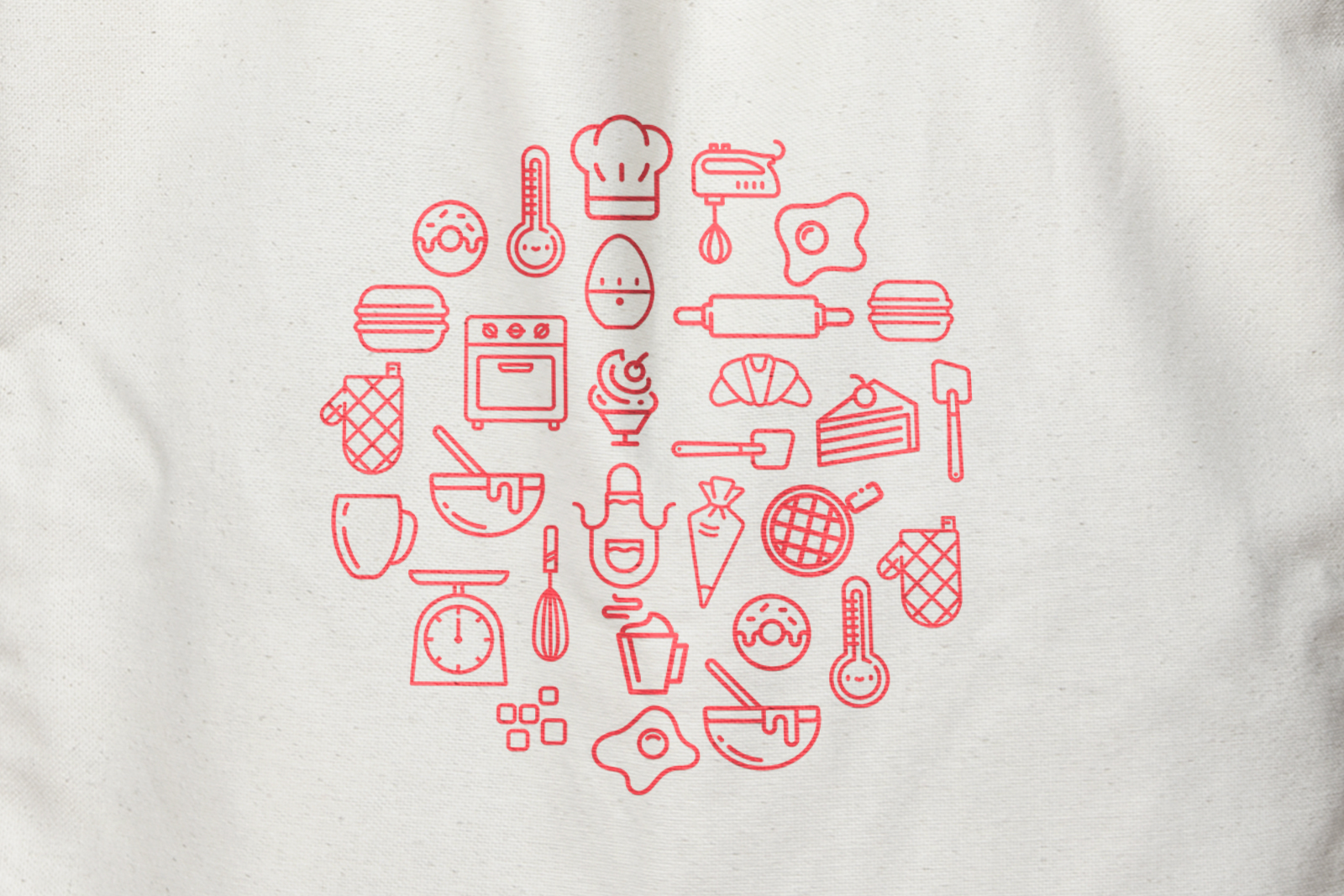
Branding and packaging for a fictional French Patisserie, predominantly focusing on Macarons. The designs portray and illustrate the process, tools, ingredients and method involved in creating such delicate and precise desserts. This is shown through the series of icons used to sit alongside the Made logotype, including tools such as weighing scales through to additional patisserie products such as donuts and decorations such as icing pipes.
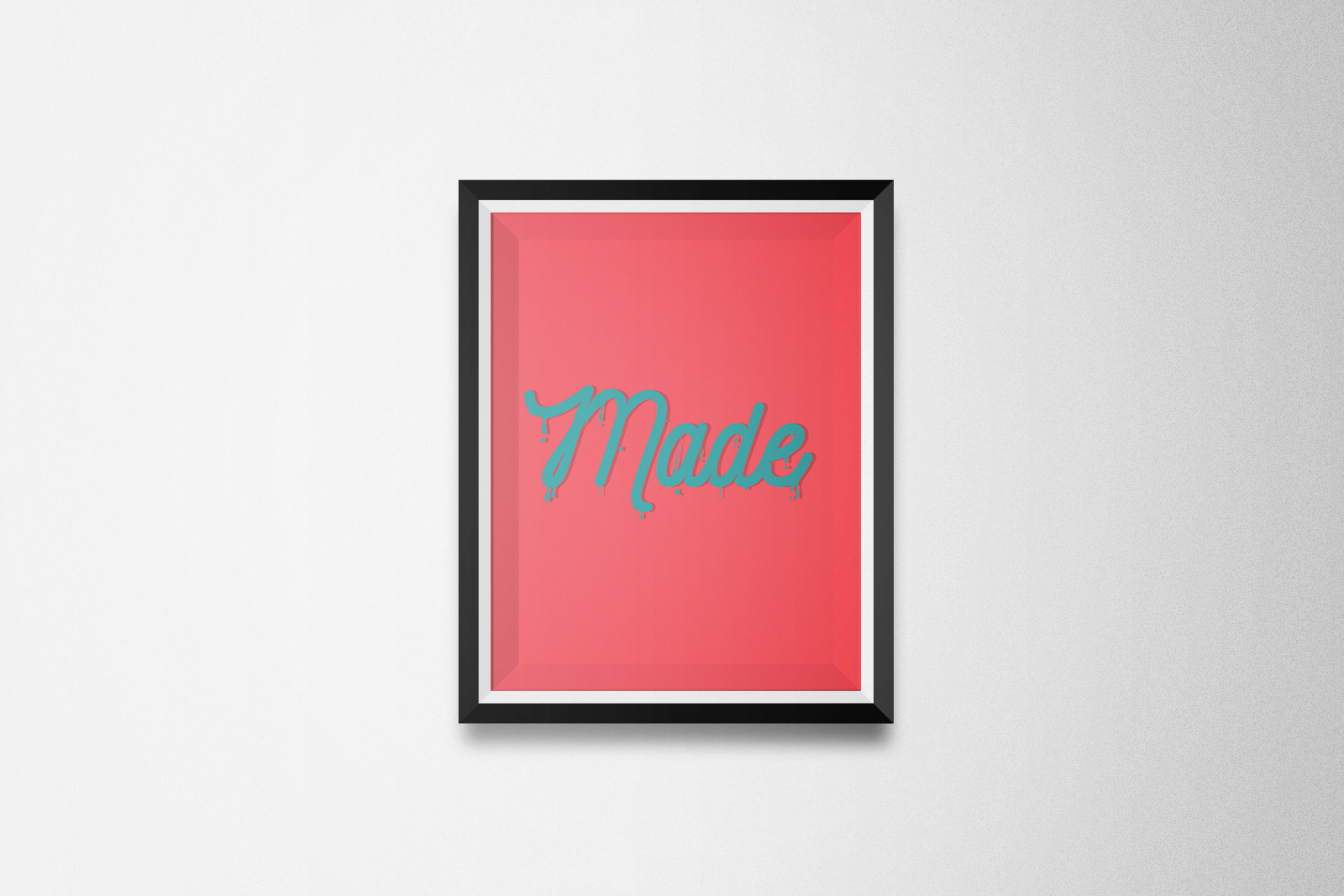
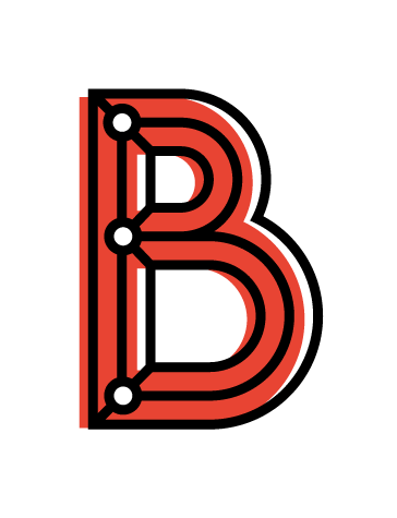
‘Sweet’ typography is used to support the patisserie aesthetic, using icing and sugar effects to be potentially placed into an environmental setting.
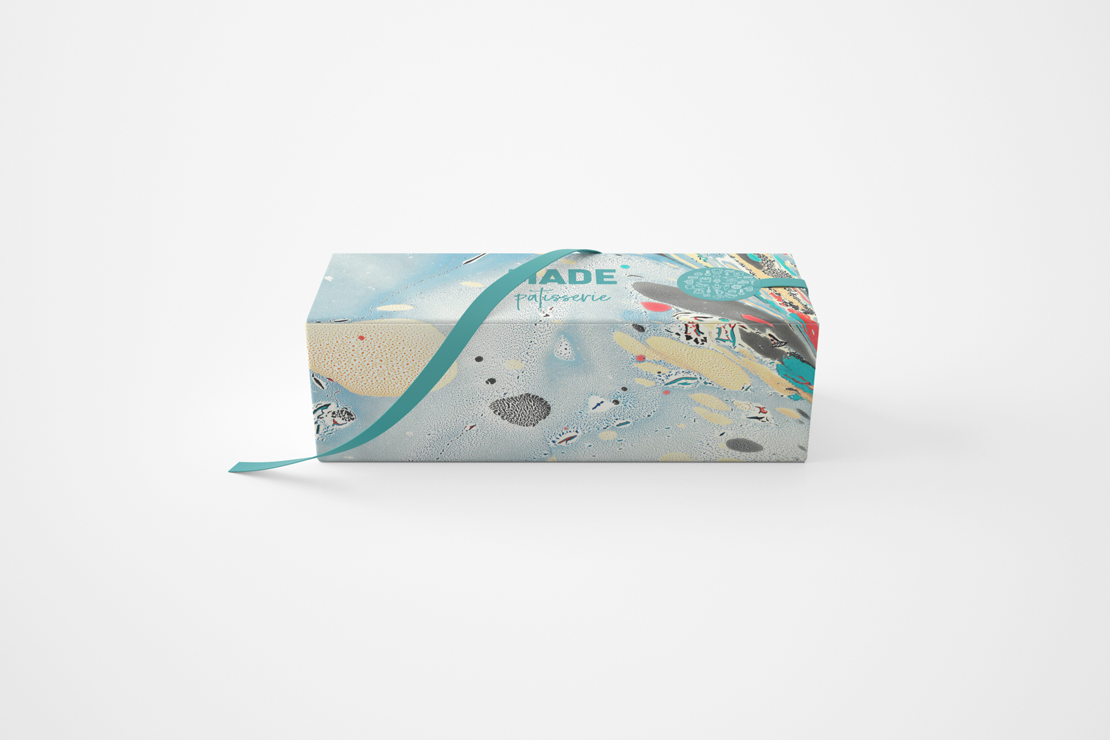
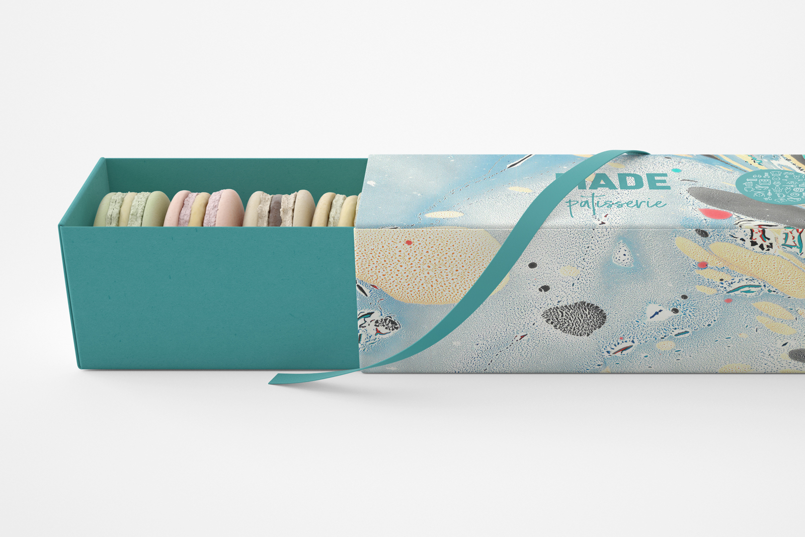
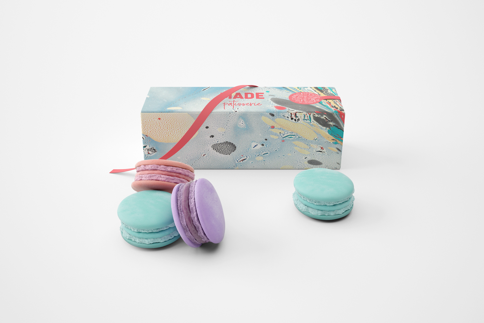
The macaron packaging has been designed to a minimal state, using the branding and iconography as a basis, supported by the bold and bright colour scheme. The design of the packaging itself showcases the product in a slimline, elegant manner.
